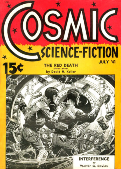
covers
FOR WRITERS: Imagining Your Cover
FOR WRITERS Today’s writer topic comes from QSFer Hank T. Cannon: When do you start thinking about cover imagery? Is it something that percolates while you write? Are some images just immediately stuck in your head from the beginning of the project? Or maybe the project is inspired by a particular piece of imagery… or is it something that comes when it’s time to publish? Writers: This is a writer chat – you are welcome to share your own book/link, as long as it fits the chat, but please do so as part of a discussion about the topic. Join … Read more
FOR READERS: Telling the Cover By the Book
FOR READERS Today’s reader topic comes from QSFer Scott: Have you ever had that a-ha moment when reading a book, when the cover image suddenly makes sense? “Oh, it’s from that scene!” or “Ah, that’s what those squiggles are.” Writers: This is a reader chat – you are welcome to join it, but please do not reference your own works directly. Thanks! Join the chat: FB: http://bit.ly/1MvPABVMeWe: http://bit.ly/2mjg8lf
FOR WRITERS: Self Pub Covers
FOR WRITERS Today’s writer topic comes from QSFer SA Collins: For the self-pubbers: How do you deal with the evolution/creation of your book covers? Do you hire an external designer – if so, what drew you to them? If not, how do you find inspiration for the covers you create for your works? Join the chat
FOR WRITERS: Cover Continuity
FOR WRITERS Today’s writer topic comes from QSFer Richard Wood: I just noted a series in which the covers for the second and third books in the series both feature the main protaginists. They bear no resemblance to one another on the two books covers. In the second book the Earth Human character has tattoos, including facial ones, and red hair. The cover of the third one shows a no facial tattoos Blond. Should authors of a series try to have continuity of the cover characters too? In this case the only thing tying the covers together is the series … Read more
FOR READERS: What I Don’t Like In a Cover
FOR READERS Today’s reader topic comes from QSFer Alexis Woods: What visual on a cover might turn you off to reading a book? Maybe it’s a cover model who has been way over-used? Maybe a bad font? Too much going on? Without naming book titles, what on a cover has made you turn a blind eye or gloss over a book? Writers: This is a reader chat – you are welcome to join it, but please do not reference your own works directly. Thanks! Join the chat
Seeing the Future
I’ve been having a lot of fun collecting digital scans of old pulp magazine covers. It’s great killing time on the Facebook group, Space Opera Pulp, where several thousand other fans of pulp magazines hang out. I save images to a folder called “SF Covers” and use a program, John’s Background Switcher to randomly display them on my computer’s desktop background. (It’s a free program for Windows and Mac computers.) Then, when I want to take a break I’ll watch a slideshow of science fiction art. Sometimes I listen to a podcast or audio books while watching. I tell JBS … Read more


