We were talking about covers the other day – the good, the bad, and the merely horrendous – which made me think of SF covers and how you can often pinpoint an edition’s decade by the cover art. Early SF cover art was largely the realm of pulp magazines, which then became pulp novels. Cheap art in a time when jobs were scarce and money tight.
Oh, the places we’ve been since then…
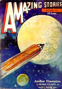
The 1930’s see the beginning of pulp art – flashy, colorful, eye-catching sometimes to the point of being lurid. Thoughts about space travel and vehicles were sketchy at best:
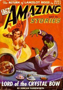
The pulps really come into their own in the 1940’s where bad guys are bad, good guys are good and women rarely get a whole outfit. Must’ve been a clothing shortage. Contrary to popular belief, though, women didn’t always play the damsel in distress:

 The 1950’s see the rise of futurism and more complex ideas about spacecraft and alien cities:
In the 1960’s, not shockingly, we begin to see a move toward more surrealist and pop art imagery, even going as far as using pieces of art not specific to covers:
The 1970’s expanded this trend into psychedelia and strange, stark imagery:
In the 1980’s we see a more illustrative approach emerge – cover art to give a feeling for the story rather than to shock the brain (and pink pegasus? Do you really think I could skip that one?):
I’ll stop there. But I know most SF readers will agree with me that they can spot the decade of a cover from a mile off.


