FOR READERS
Today’s reader topic comes from QSFer Alexis Woods:
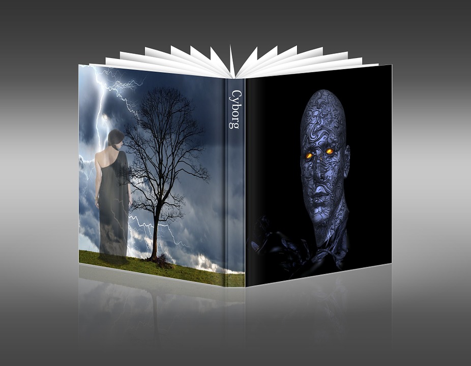
What visual on a cover might turn you off to reading a book?
Maybe it’s a cover model who has been way over-used? Maybe a bad font? Too much going on?
Without naming book titles, what on a cover has made you turn a blind eye or gloss over a book?
Writers: This is a reader chat – you are welcome to join it, but please do not reference your own works directly. Thanks!


